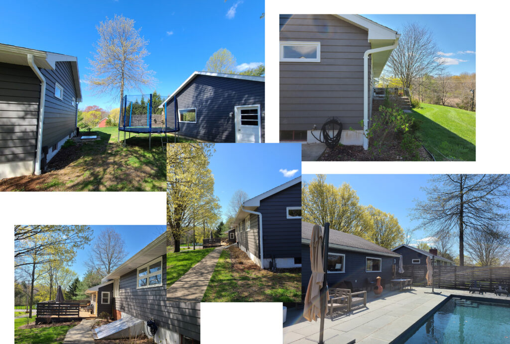
Artists’ Ranch is a renovation in Germantown, NY for an artist couple and their two young children. Their existing home is split into two separate structures; one a garage and the other a ranch house. With the goal of marrying the two volumes and expanding the living space, we designed a new modern structure that creates a cohesive home better suited for our clients’ lifestyle.

In this blog post we will recap our process designing this modern renovation. We not only designed a more functional environment for our clients, but we created a transformation that encourages and supports them in their creative endeavors and familial love. Now for a trip down memory lane…
Behind the Design: Artists Ranch
Pre-Design and Sketching
This was a bit of a unique kick off for a project because we started it in July 2021 when COVID 19 was beginning to plateau and social distancing eased. We were eager to be able to visit our clients to see their home. Quickly in our pre-design phase we learned that our clients love to spend time outdoors – whether it’s running around the expansive front yard or playing in the pool. Immediately, we knew that an additional space at ground level would allow the indoors to open up to the beloved exterior spaces.
Schematic Design
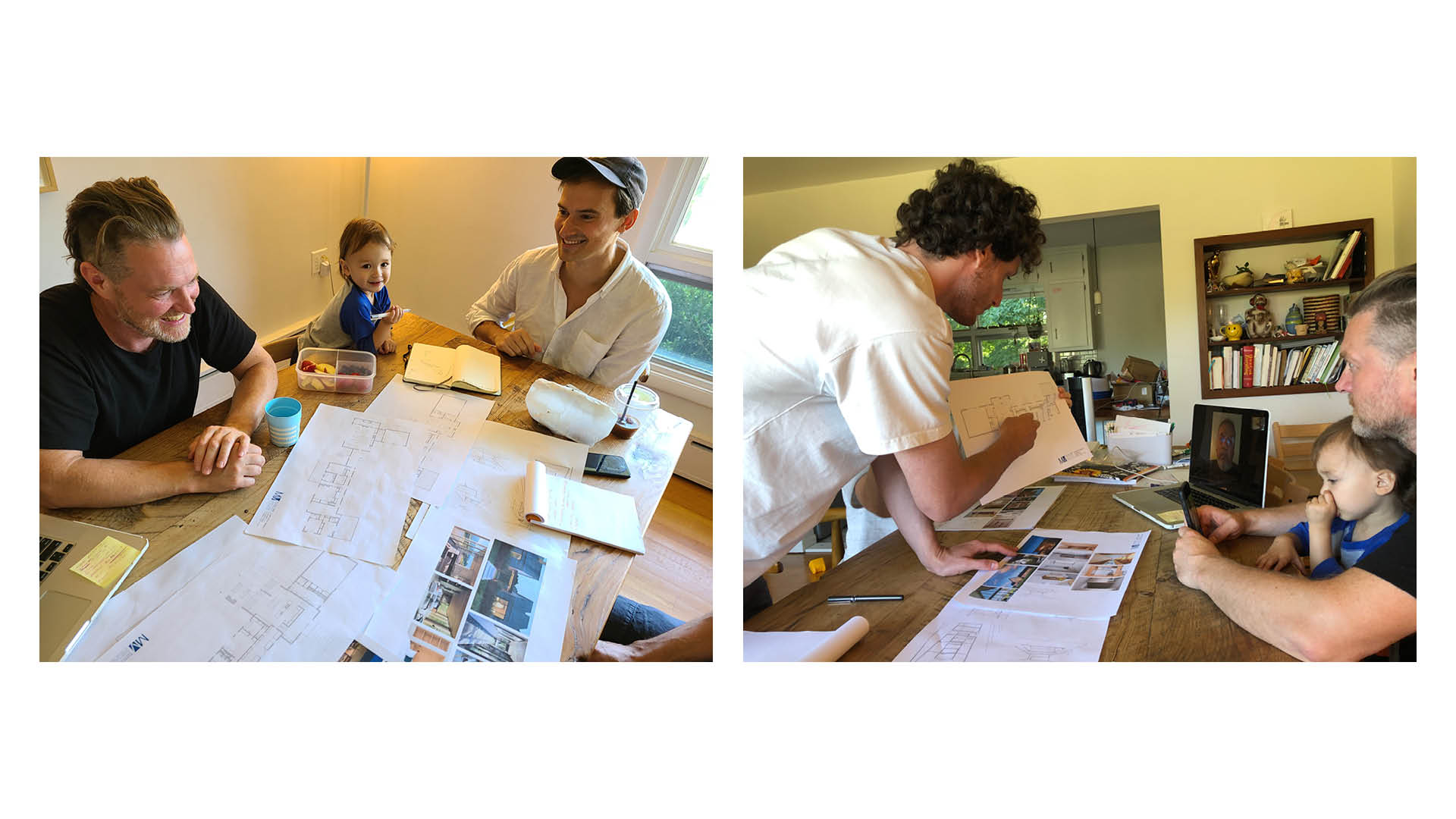
We began to flush out many design ideas on how to transform the existing home during our schematic design phase. We had such a great SD1 meeting at our clients’ home where we got to experience the house and the use of the space. A fun bonus during this visit was that we got to garden, eat donuts, and play with the youngest member of the family!
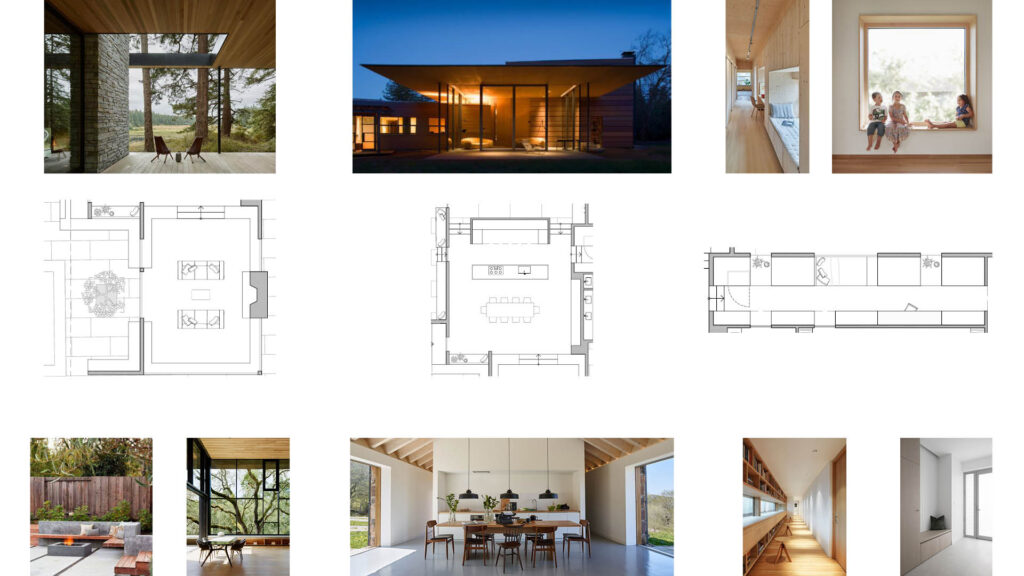
After our initial SD meeting we learned our clients’ likes and dislikes of each proposed scheme, creating new designs for our next meeting. The inspirations for our schemes presented a number of different strategies that incorporated generous storage, open spaces for gathering, and considerate landscape interventions for this family of four.

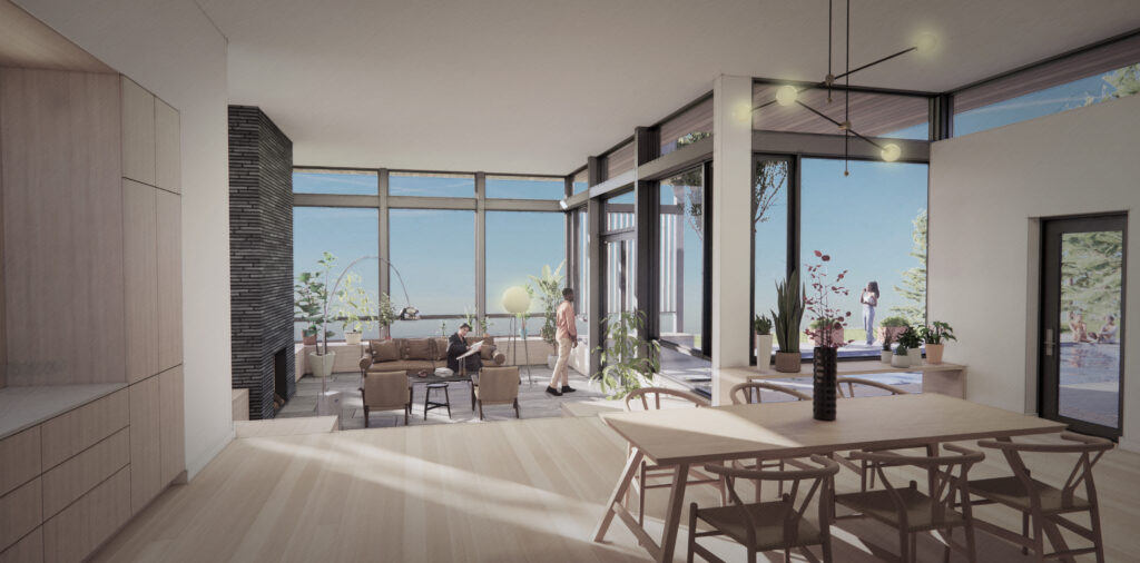
An important part of our design process focuses on how to create “scenes for living.” For our clients at Artists’ Ranch, these physical spaces were translated from personal stories and dreams that were communicated to our design team. We designed three ‘vignettes’ for this growing family to enjoy in their future home: first, a spacious living room that seamlessly connects to an outdoor sitting area for morning coffees; second, a walled volume of support spaces that allow cooks to converse with guests or family members sitting at the dining table beyond; and lastly, a long hallway connecting the home has been transformed by selectively placed daybeds, picture windows, desks, and storage. These smaller pockets of space provide private and cozy nooks for reading, thinking, and quiet.
Design Development – Exteriors
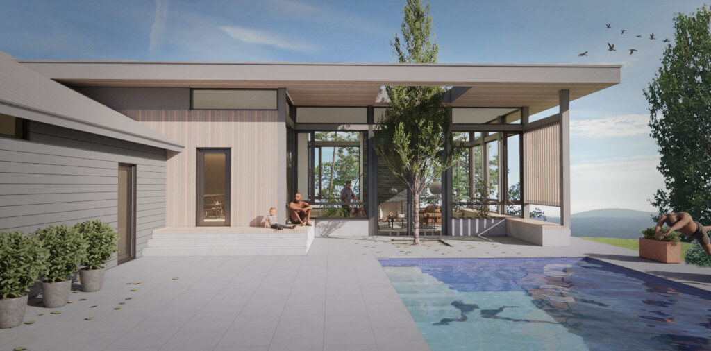
Once we moved forward with a scheme, we further developed the design into different three-dimensional possibilities. We created two schemes that connect the existing garage and ranch house together. Scheme A landed just below the roofline of the existing structures, whereas Scheme B was situated above them. Each scheme’s positioning in relation to the existing structures created very different outcomes in interior and exterior articulation. Our clients liked aspects of both schemes and requested that our design team work on hybridizing those elements into a new, and final design.

Design Development – Interiors
DD2 is the phase in which we talk about all things interior. This includes built-ins, kitchen and bathroom layouts, interior finishes and lots of other things. This project features a ton of built-in storage and an entire hallway with custom millwork on both sides. As we mentioned, our clients are creative people with young kids and they know they need lots of storage to keep their newly remodeled space tidy. Beyond just storage, the display of art and books along with spaces for relaxation and play were important to incorporate into the design. Through the use of sketches, drawings, 3-D modeling and inspiration images we were able to work with our clients to produce a series of designs unique to them and their lifestyle.
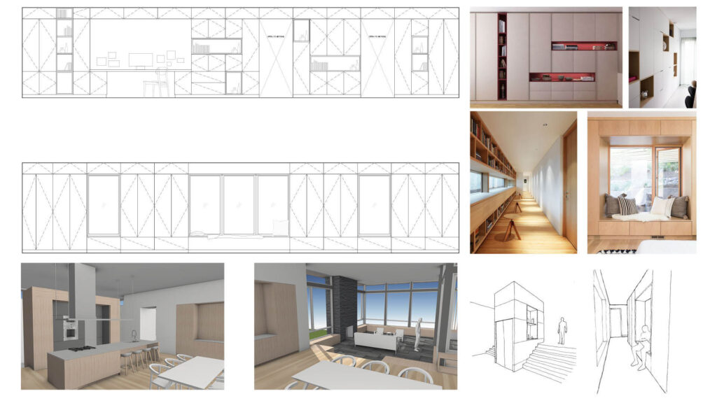
As we finalized the design, we created these renderings to best visualize what’s to come. Adding plants and people into the model brings the proposed home to life. We like making our renderings a bit sketchy and not hyper-realistic to save room for imagination.

ICYMI, our most recent Behind the Design blog posts:
Behind the Design: Barnstormer
Behind the Design: Big Indian Reno
Behind the Design: Tranquil Guest House
And to see more of our renovations visit Featured Projects: Studio MM Renovations
1 comments