One of our biggest goals on this blog is to share the process of designing a custom home. We aim to demystify what happens behind the scenes in our office and during our client meetings. While we share a lot of information online, we know that sometimes an in-person conversation is the best way to answer specific questions. Don’t hesitate to reach out if there are questions that we can answer!
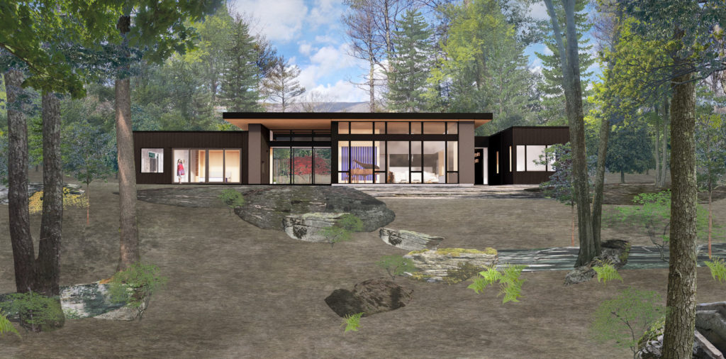
In the past, we’ve taken a closer look at the design behind several of our modern homes, including RQHQ, Tranquil Abiding, Cat Hill, ClusterOne, and Kaat Cliffs. Today, we are diving into the design process of Fermata. Designed around a central courtyard that is inspired by a sense of breath and peace, Fermata will be our client’s new forever home. We’re aiming to start construction soon, so keep an eye out for Construction Update posts in the coming months!
Behind the Design: Fermata
Pre-Design
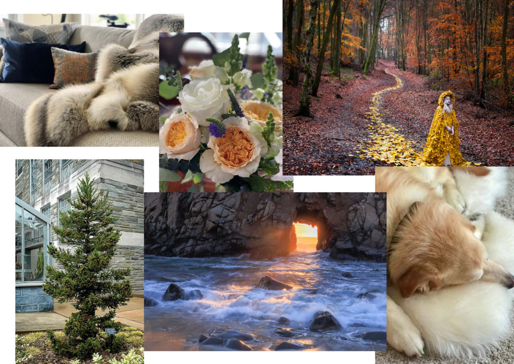
Our process for Fermata began with such exciting inspiration images from our client, featuring vibrant colors and textures that exude comfort, calmness, and peace.
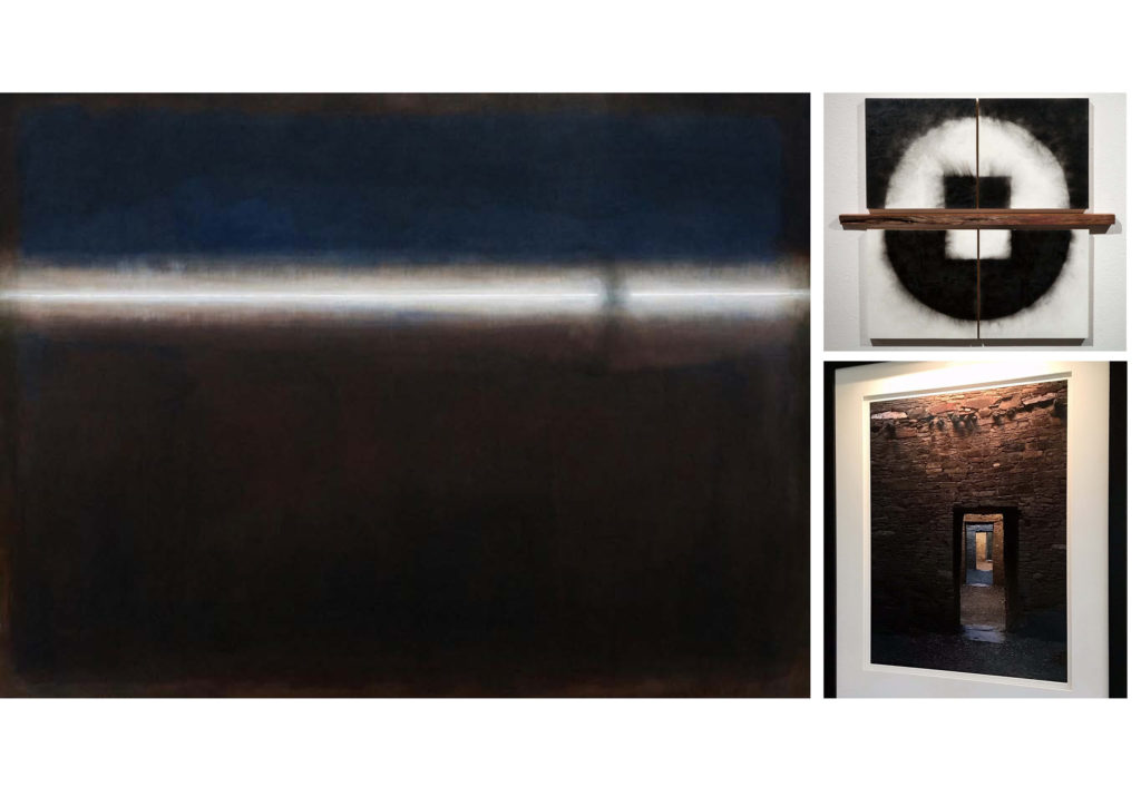
Fermata is named after a key piece of artwork owned by our client. The word is a musical term that is means a pause of unspecified length. This single story home will be a space designed to encourage pause, breath and reflection and will give space to stillness. We’ve also been especially inspired by our client’s other artwork, all of which will play a key role in the design of her new home.
Sketching
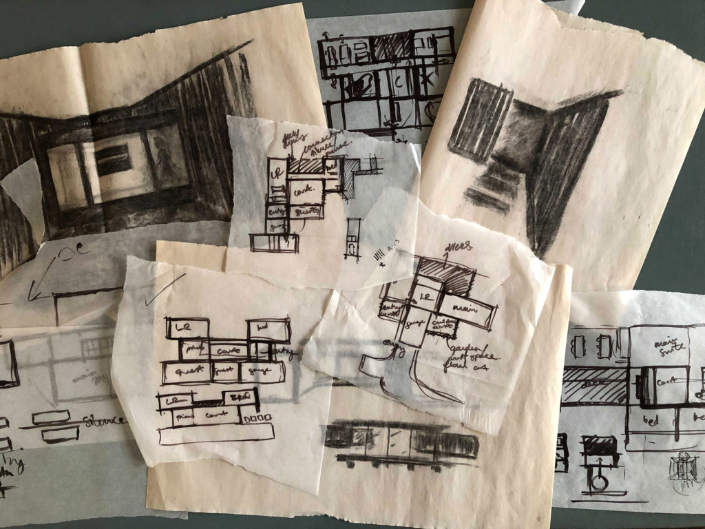
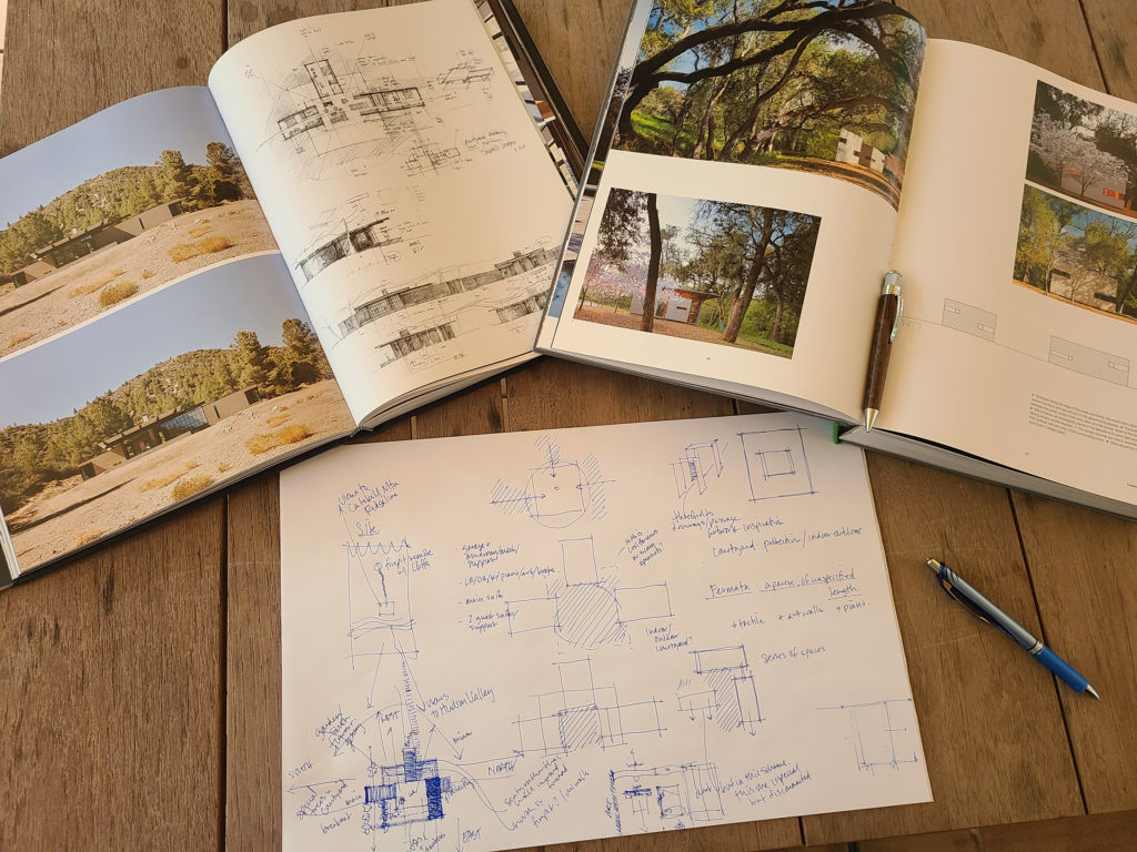
With all of these inspiration images and our client’s responses to our questionnaire, we went straight to sketching and experimenting with ways to have the house mimic the energy of the images. We focused on creating a space that invites pause with a central courtyard and a few special moments. We also designed with her art collection in mind – where specific pieces will be placed and how they enhance the home’s composition.
Schematic Design
We presented three schematic designs (SDs) to our client during our first SD meeting. One scheme focused on central axes and an overhanging roof. The second was broken up to three bars of space, with the middle symbolizing a sense of breath. The third was designed around the idea that behind every door a new adventure awaited. With our client, we moved forward with the third option.
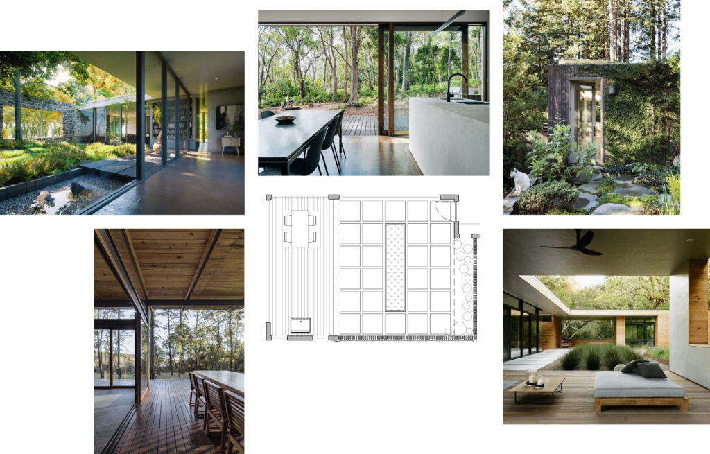
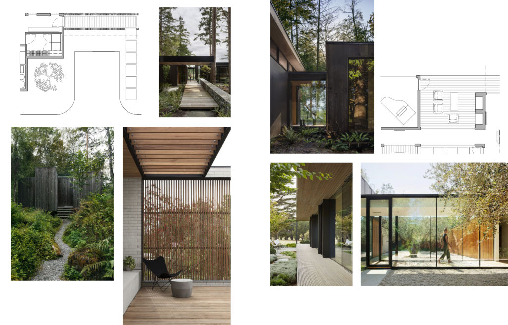
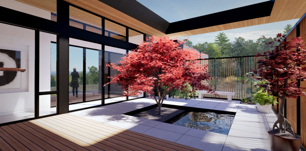
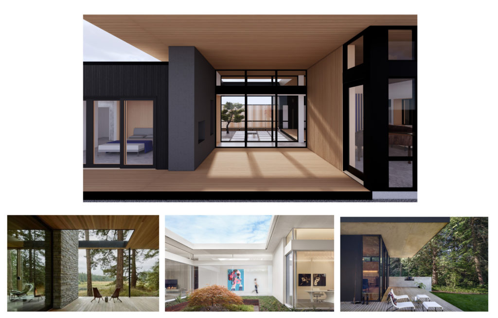
Our design for Fermata is focused on a large central courtyard space that flows seamlessly from indoor to outdoor living and dining areas. The space will be used for gathering, quiet reflection and gardening featuring large overhangs, a central water feature and a secret garden door. We’ve also paid particular attention throughout our SD process to the entryway, considering a meditative approach to the house that feels intimate and emphasizes a sense of privacy.
Fermata will also feature two unique connection points between the main living space and the more private guest bedrooms and main bedroom. A smaller and simpler glass walkway connects the living area to the guest suites and outdoor firepit. A longer and more dramatic hallway that emphasizes the home’s central axis leads past the courtyard and front deck space to the main bedroom suite.
Design Development – Exteriors
Once we decided on the scheme to develop, we began selecting materials and focusing on details.
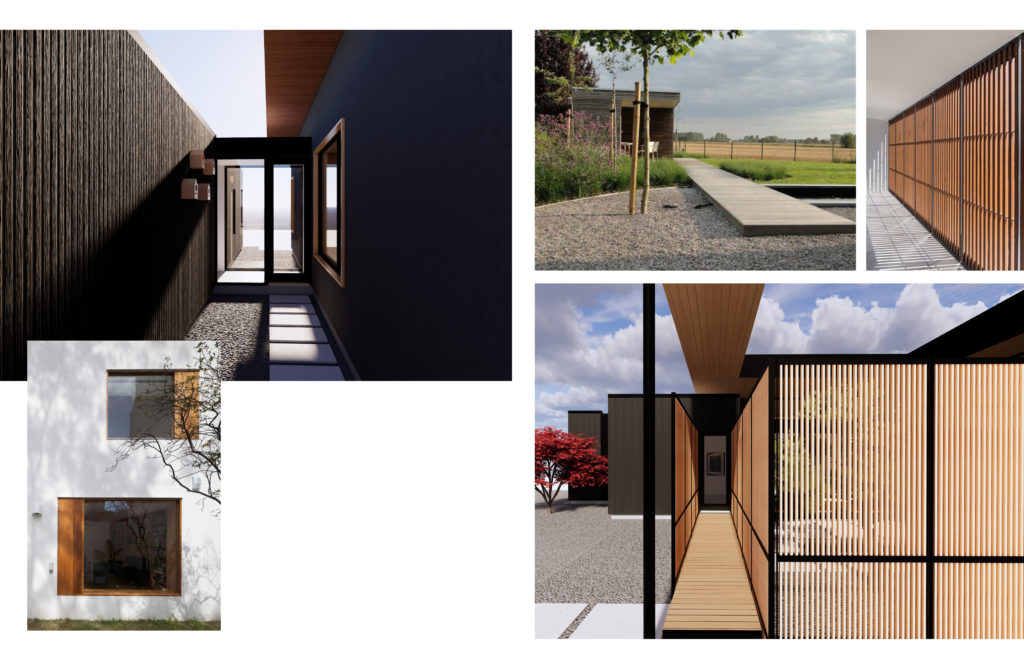
Through a careful selection of materials and color palettes, the home takes on a cohesive aesthetic while showcasing each special moment. Three stucco volumes create threshold spaces that border the main living space. In the largest of these volumes, we’re articulating the two window seats with a unique exterior wood detail that mimics the interior thresholds.
At the entryway, we’ve developed a unique wood and steel screen that ties two materials together found elsewhere in the project. The screening and boardwalk below provide a contemplative walkway and privacy for the internal courtyard.
The walkway between the living space and the main bedroom will feature large panes of glass and a clerestory level of windows, creating a lofty connection that is grounded by a clear sense of rhythm. The walkway looks out to both the courtyard to the west and to a cozy deck to the east.
Design Development – Interiors
Moving inside the home, we worked closely with our client to select finishes and fixtures that accentuate the home’s design.
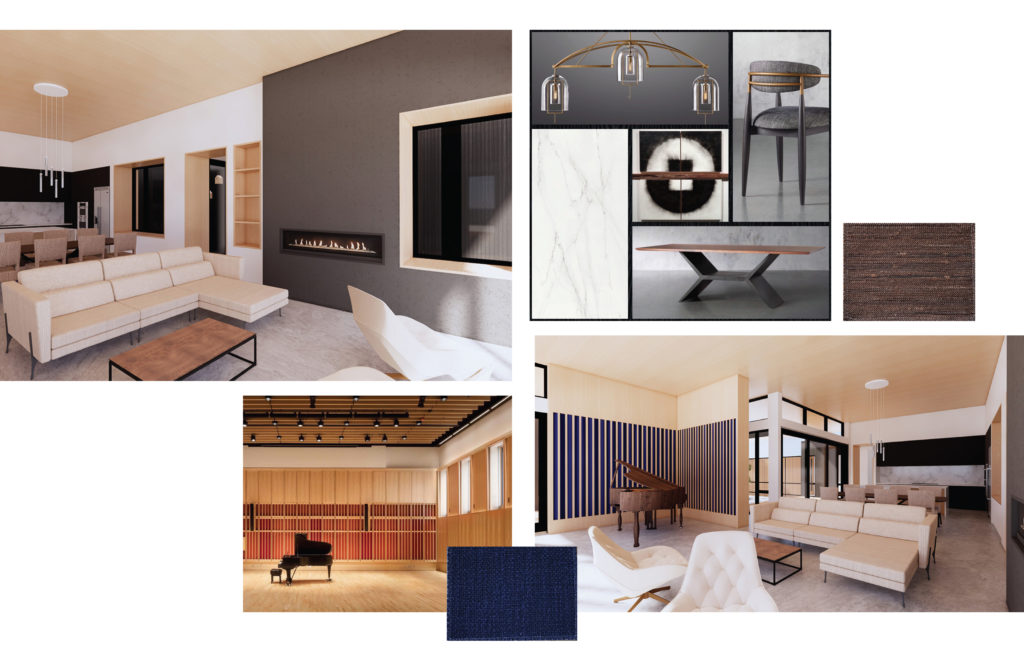
The main living area will feature a stucco wrapped gas fireplace and a number of wood-lined window seats that will serve as cozy reading nooks. The open space is tied together through natural woods, warm brass lighting fixtures and neutral fabrics. The piano nook will feature a blue striped acoustic wall inspired by university music studios. The blue fabric will bring a sense of warm elegance to the space.
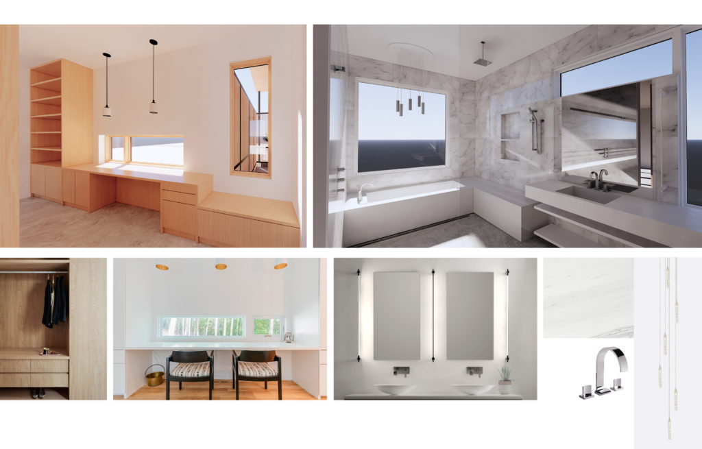
In the main suite a built-in home office uses warm woods and curated views of the western ridgeline and courtyard to bring focus and warmth to the space. The main bathroom is designed to evoke a sense of calm with a tight color palette of whites, greys and silvers tied together by a marble tile.
Construction Documents
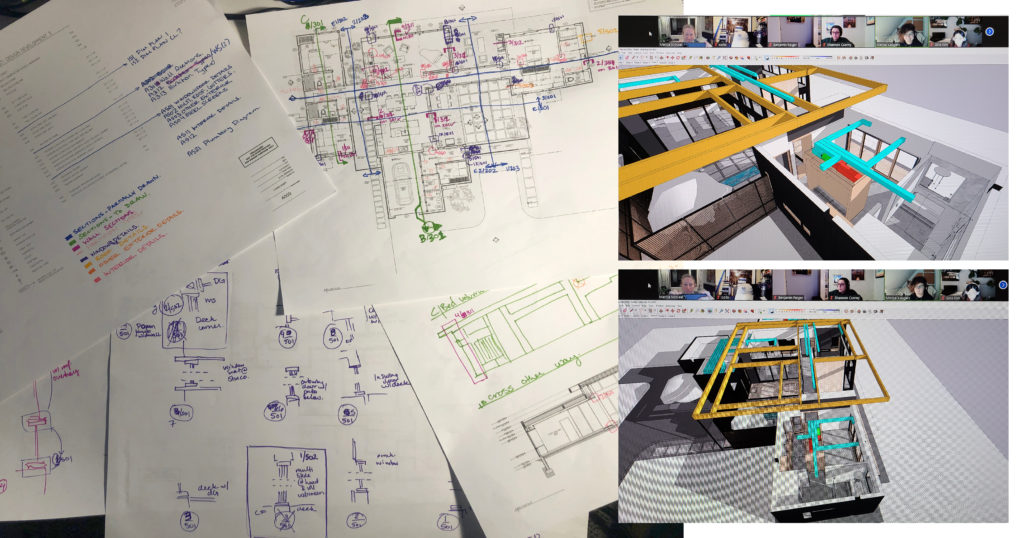
As we finalized our design, we created construction documents (CDs). The first step of the CD process is to make what we call a cartoon set. The cartoon set is a roadmap for us as we draw through the set. For Fermata, we color coded our drawings to make it quick and easy to reference. We also build HVAC models in Sketchup. These models navigate beams, trusses and other obstructions to ensure that all of the equipment and ducts have enough space.
We are eagerly looking forward to the construction of this home that encourages our client to sit with her natural surroundings and care for herself and those she loves.
