I am currently in the unique position of acting as the design architect on a very large modern house project. Unique because this is my first experience, since starting my own firm, in collaborating with another architect on a project. This is a fantastic responsibility and I am extremely lucky as a small firm to be able to work on a house of this scale. The background and more collaborative stories I’ll save for a future post, but the setup is necessary so you can understand where I’m coming from… We are working with a firm that historically designs more “traditional” homes and the design for this home is far from traditional.
Lining Things Up!
At this point we are in the Design Development stage of the process and the other architecture firm is doing most of the CAD drawings, which only adds to the uniqueness since I am accustomed to doing all of this “in house.” Almost every time we meet I find myself sketching lines over the drawings and talking about “lining things up.” During our discussions the words “line it up” would come out of my mouth so often I could feel the team’s eyes rolling every time it did. I tried to mix it up with comments like “align” or “same plane” or “in line with” – all for the same effect: Line it up!
I began to think perhaps I was crazy. Maybe this obsession with lining things up was just a little too much and I needed to relax a bit. But then I walked into Frank Lloyd Wright’s Robie House……
Design is in the Details: The Robie House
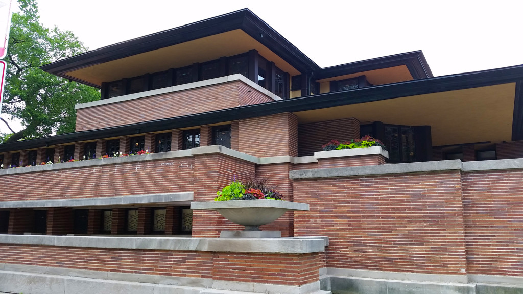
A few weeks ago, as many of you may know from our previous Chicago Architecture post or from my guest post on Novedge’s blog, I toured the architecture of Chicago during the AIA convention and one of the highlights was a visit through the Robie House by Frank Lloyd Wright.
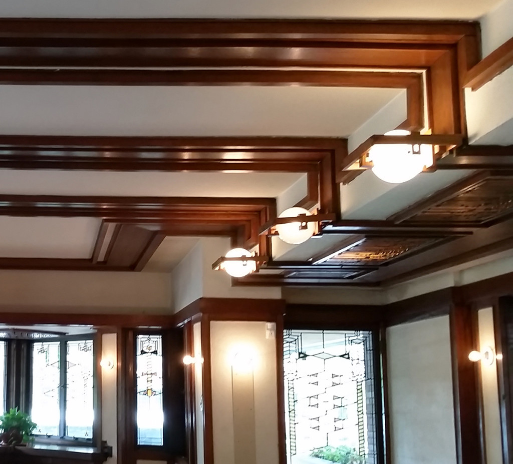
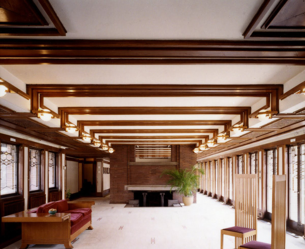
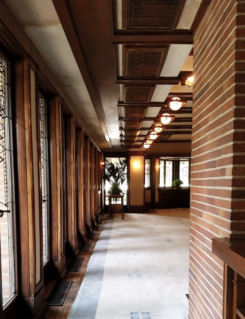
The house is stunning. I’m not going to give you the “book report” version for the Robie House- I’ll just say that it is WAY better to visit than to read about or look at in books (or blog posts). What struck me immediately was that the house seemed so simple and so complex at the same time. The details in the house were so precisely designed- the wood trim in the ceiling lines up with custom wood light covers which align with windows on either side of the room. The design is extremely fine tuned with everything in its place, and everything lining up. There is a subtle rhythm to the Robie House because all of those complex details came together to create one unified home. It felt comfortable, and calm. All of that lining up didn’t complicate things, instead it gave the house order and simplicity.

(Please excuse the quality of the image- let’s just say photography was difficult.)

Interior Living Room of Robie House courtesy of the Frank Lloyd Wright Foundation.
“The details are not the details. They make the design.” – Charles Eames
I worked for an architect in the past who was possibly as rigid as Frank Lloyd Wright must have been about details and everything in alignment. If there is one thing that I bring from that experience into my residential architecture practice it is surely, “Line it up!”

