It may be surprising to learn that some of our most important work happens while our projects are under construction. Our drawings and design work is critical, of course, but it is just as important that we are present during the construction of your home to keep an eye on progress. Believe it or not, we go on site visits not just to get excited about the project! We observe construction and make sure that things are being built as per the design intent of our drawings.
Our work during construction can also include answering questions from the contractor. We also often approve payment applications, and organize team site meetings to make sure we’re all on the same page. We’ve talked about all of these tasks in our past blog posts on construction administration and on construction management. One aspect of our work that we don’t often talk about is how useful it can be to have us involved in the construction phase to allow for responsive design.
We’ve recently been working on a number of different projects where we’ve been “designing during construction”. This takes on a variety of meanings depending on the project. Today we’re sharing some great examples from three different projects.
Fermata
Fermata is one of our current construction management projects, so we’ve been very involved during construction. While our client is fantastic and has made very few changes during construction, we’ve been working on adjusting a few things to better suit her needs.
Designing for New Family
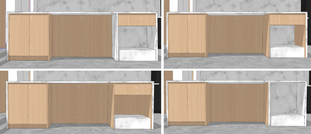
After we completed construction documents on this project, our client adopted a beautiful NewfiePoo. As we’ve been working on finalizing kitchen drawings with our cabinet makers, we realized that her new friend doesn’t have a convenient place to eat. Each of our homes is so meticulously designed that we don’t typically leave extra room in floor plans – meaning there wasn’t a convenient spot for dog bowls. We’ve been working with our client on adding a dog bowl station to her kitchen island.
This will help to contain any messy eating, provide a consistent spot for her pup to eat, and will help to keep the bowls out of walking paths. This is a great example of the way that we can take initiative and respond to changes in a client’s needs.
Designing for Comfort
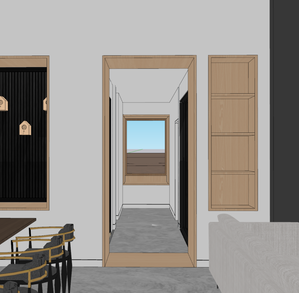
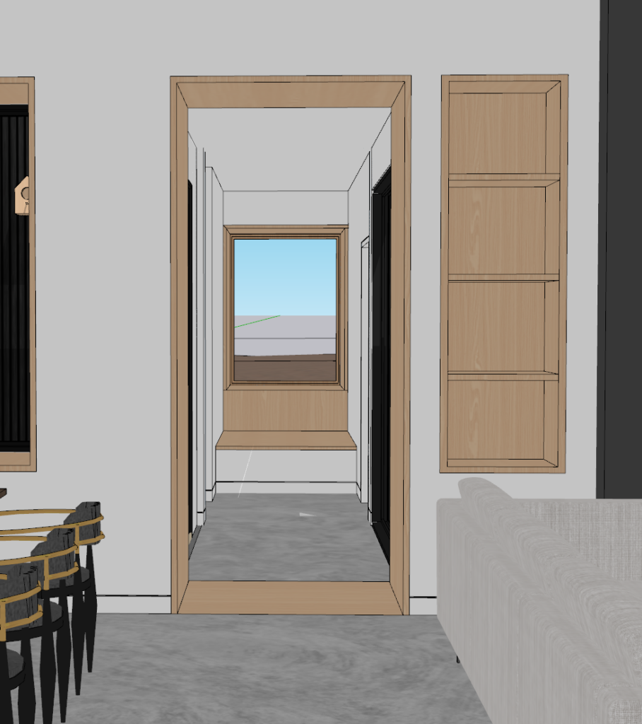
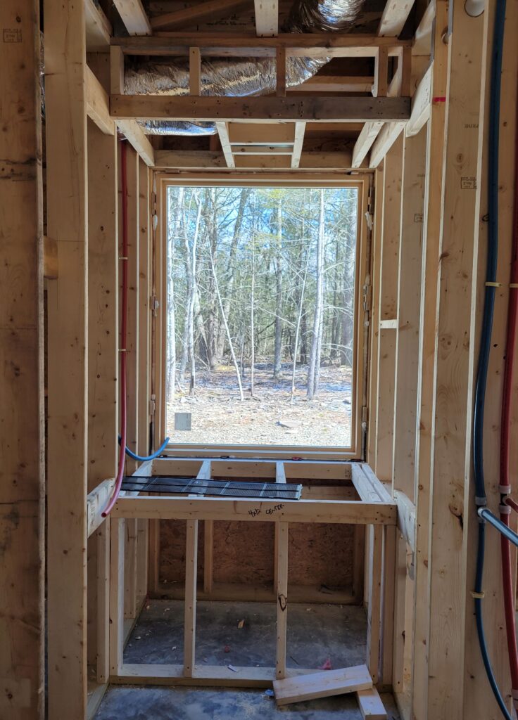
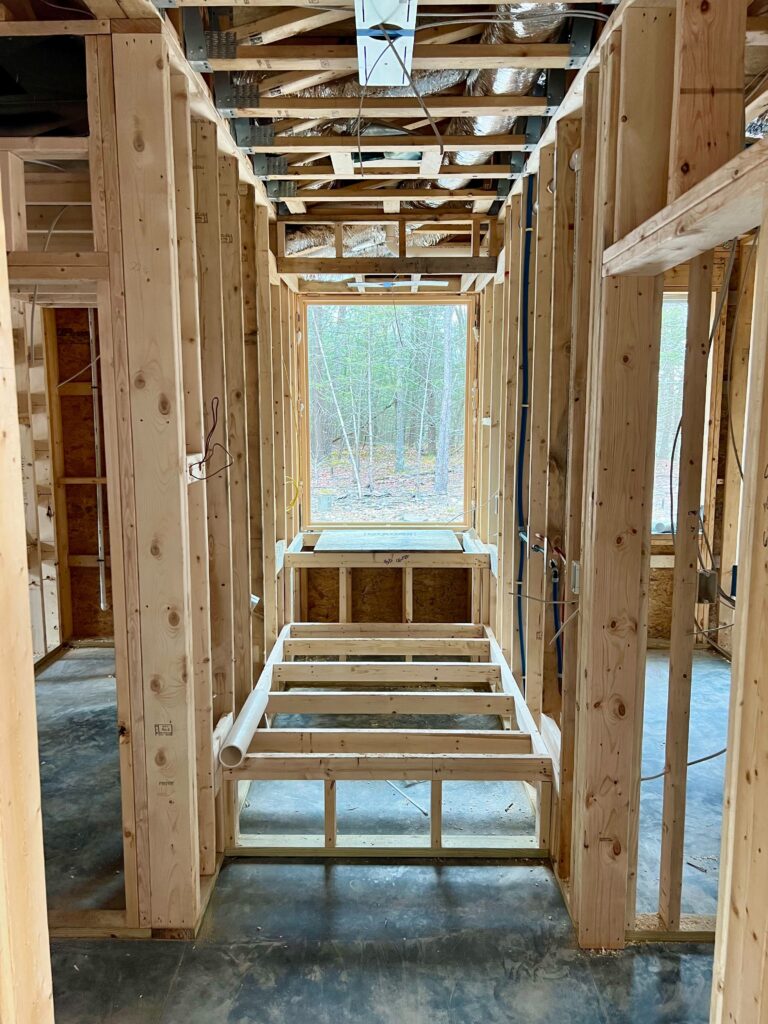
Another change that we’ve made during construction is part of a critical axis through the home. The central axis is the central organizing principle for the home’s floorplan. At the end of this hallway axis is a window seat. During design, we aligned all of the windows on that side of the home to a 32″ datum line. We discussed that this is high for a window seat, but decided with our client that we could make it work.
Our whole Studio MM team was onsite after the initial platform for the window seat was built, . As we were looking at the window seat and the hallway leading to it, we realized that even if our client and her family might be able to hop up onto the seat, it looked too tall and didn’t feel inviting. We proposed a few solutions to our client. We landed on a larger extension of the window seat that also created a secondary seating area. The result creates additional seating and hangout space. Our client even joked that we had made the house into a four bedroom!
Woodland Pop House
A very different example of how we can collaborate with clients and contractors during construction is Woodland Pop House. This renovation project started construction before our clients had a chance to make all of their selections and decisions.
While we don’t usually suggest this method, it has worked really well on this project! Our clients have amazing inspiration and strong design ideas. Our work has primarily involved drawing up options to help them visualize those ideas in their own space. We’ve also been working very closely with the contractor. We keep him in the loop on what decisions have been made, what we’re working on next and what is still outstanding.
Designing for Color
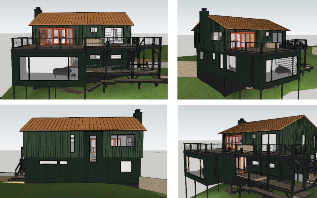
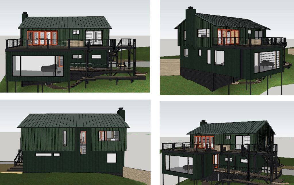
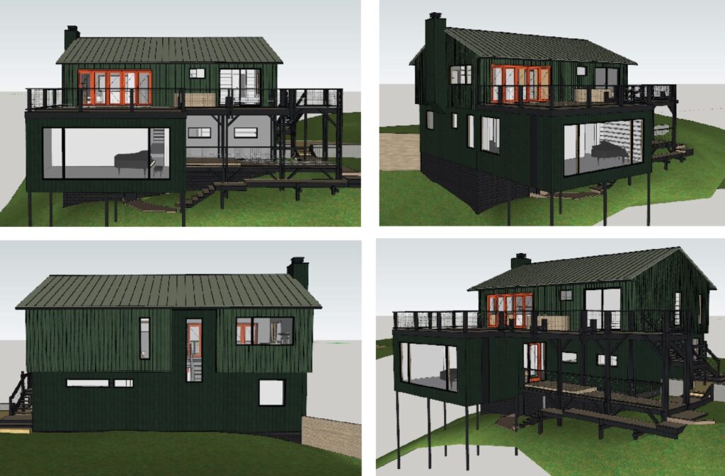
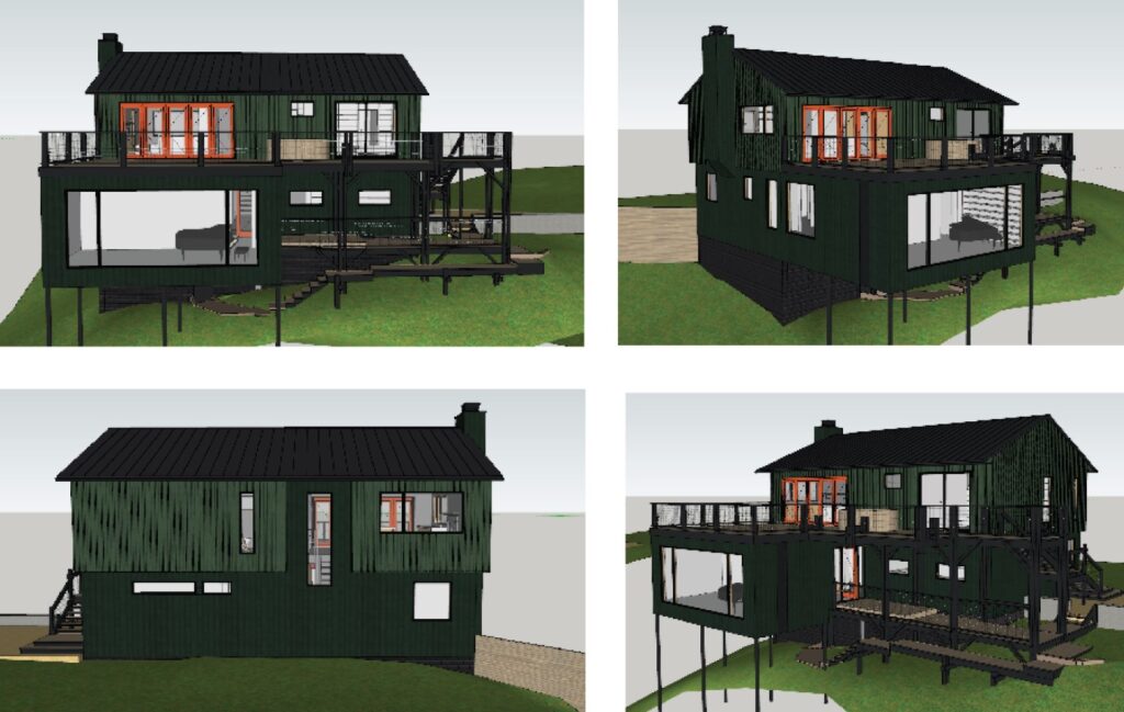
One of the things we’ve been working on throughout this project is color selection for the exterior. Our clients made decisions on the colors of windows and doors a while ago when they had to place these orders. They went with a bright orange color for the front door and kitchen bi-folding doors. When it was time to select a final roofing color, we put together a few options for them to choose from. These ranged from a copper orange color to various shades of green.
Designing for Coordination
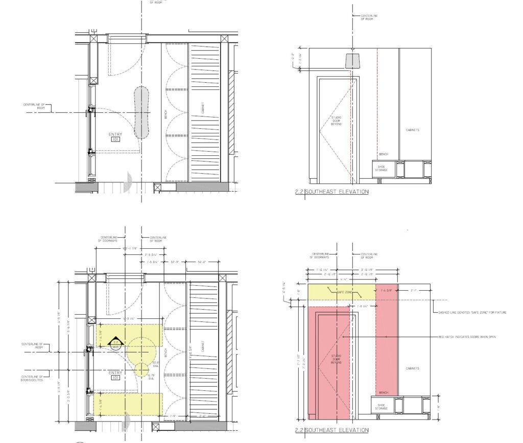
Another recent design problem we’ve been working with our clients on is the pendant in the home’s entryway. An efficient space that also features a number of swinging doors, we worked with them to create “safety zones” for a feature pendant that they wanted to hang in the space. These diagrams proved critical! The initial options they were looking at for the pendant were in danger of getting hit by the swinging doors.
Designing for Cohesion
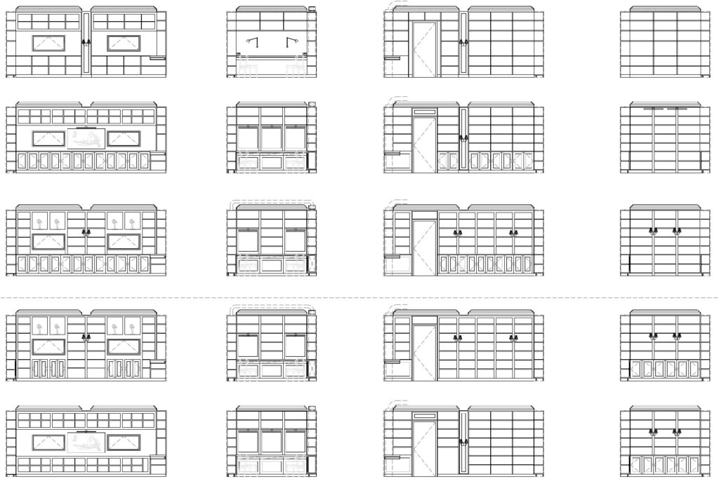
One of the most important parts of this house is the clients’ new library space. We’re building out coffer beams and four walls of millwork that will create an elegant and inviting workspace. We’ve been coordinating the fixed window openings with revised desk spaces, lighting options and millwork paneling. We drew up a number of options that helped our clients make decisions on how they want all of these elements to come together to create a cohesive space.
Art Fort
Designing for Landscape
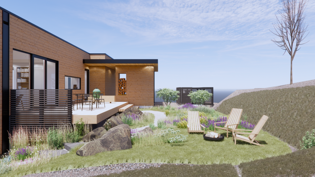
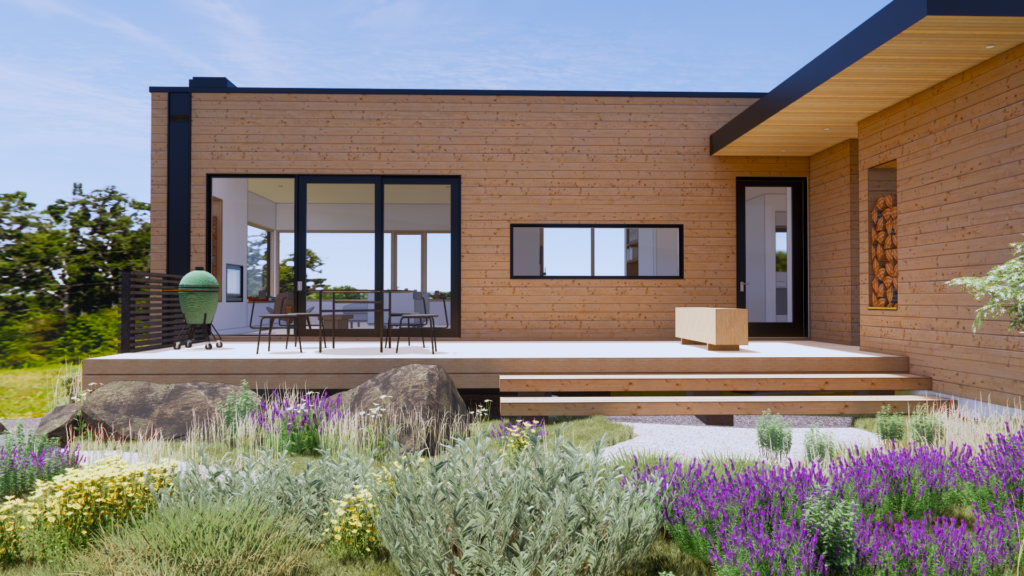
Finally, another example of how we use our design sensibilities during construction can be found at Art Fort. The site is steeply sloped, and final site grading around the home changed how we imagined the original landscaping. Our client expressed interest in working with a landscaper but retaining us for landscaping design services. We’ve worked with the selected landscaper before and are big fans of his work, so we are leaving many of the plant-specific decisions up to him, but are helping with the overall layout and design concepts.
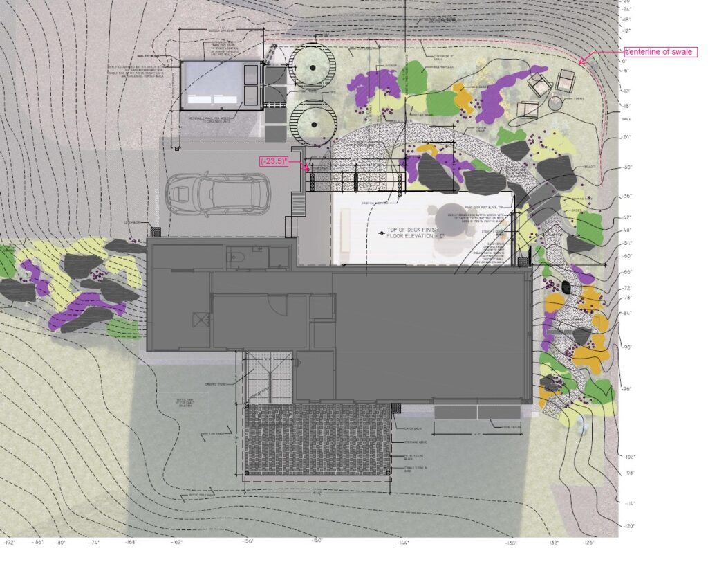
The landscaping plan focuses on the space between the front entry area of the house and around the sides. The front entry backs up to a drainage swale at the base of the hill and our client wanted more intention for the feel of this space. Boulders, a gravel path, strategically placed trees and a few areas of screening will provide structure to the otherwise planted zone. A firepit space tucks between the house and the back slope. A gravel path interspersed by stone steps will lead around the side of the home to the art studio. Rosemary, lavender, grasses and wildflowers will fill the planted areas. Creating a cohesive landscaping plan has been a fun endeavor and we can’t wait to see the results!
